Designing a website is not only essential in the 21st era but also challenging as competition sprouts on the global table. Web designing can almost be personified to painting, where the web poses as a canvas and tools like jQuery , CSS, HTML are brushes. Some designers excel at this field intuitively but even a well ranked company like SEO Web Design Singapore needs work to refine. Hence, to make the painting picture perfect, there are a plethora of things that one must be mindful of when designing a website.
Failing To Make The Site Responsive
Making your website responsive is non-negotiable. A responsive website has a fluid and flexible layout which adjusts according to screen size. The importance of responsive web design is that it offers an optimized browsing experience. Logically, if the trouble of zooming, scrolling, resizing, or planning is eradicated, the audience would like to loiter about on your website even more compared to hassle one has to face while making the necessary adjustments to their gadgets. Most of the customers may or may not be tech savvy and the are bound to become annoyed when they have a hard time figuring out how to navigate through the website. Hence, costing you potential customers. There are other advantages tailed to a responsive site like the website of SEO Agency Singapore which include – lower bounce rates, cost effectiveness, search engine optimization gains, higher conversion rates and ease of management.
Not Doing The Audience`s Homework
A website cannot be for everybody. A website should be focused only and only on your customers. The designer is obligated to do his own research and find out who the potential clients are and who are the people that this website will entice. While developing a website you must not settle for phrase, “if you build it they will come.” The correct approach however is to build the website bearing in mind the potential client`s desires and what they would look for in a website. In fact, the pro tip would be to design your website in such a way that induces the question why should customer care? what are the measures you could take to make their life comfortable via your product? What extraordinary step are you taking that makes your website unique? Because let`s face it, any customer would not just click on a product and buy it in a jiffy. Hence, Organizational self-regard is no substitute for fact-finding.
Do Not Design A Website Without Paying Necessary Heed to One’s Location
This might appear surprising to many people but someone`s location has an impactful role to play when designing a website. Depending on where you live, most people will search for the most relevant information in the top left corner. If you surf the website of SEO Agency Singapore it would suggest that your links or data should descend in importance from left to right and top to bottom.
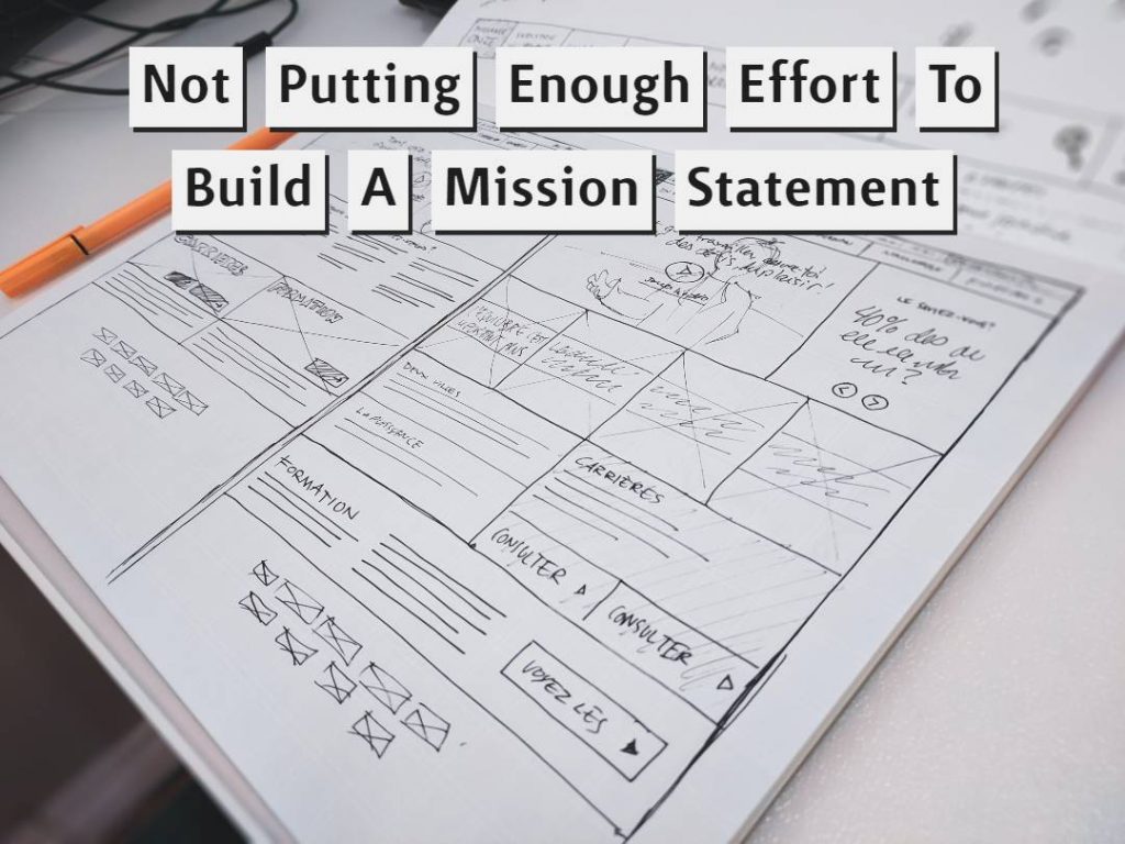
Not Putting Enough Effort To Build A Mission Statement

A mission statement is one of the prime fundamentals of a website. The mission statement provides entrepreneurs with a clear and effective guide for making decisions. An optimistic spin is equally essential to generate a long-term employee investment and criteria is the gateway that would bring profit to a website. A good mission statement would attract the right crowd. What some designers tend to do is settle for a mushy copy that has been overused. And, some are plain bland. A well put mission statement would appear catchy and definitely grab the viewer`s attention and accelerate the owner`s website one step higher to making him stand out.
Pay Attention To Color Scheme
A huge mistake would be to avoid the color schemes. Color combination of background and graphics color is extremely important for making a website charismatic. You must have to choose the right color at the right place.
However just steer clear off this color combination i.e. black background with red texts or other shady combinations like this. Any site which does it tends to hurt the reader’s eyes and will shun readers from your site. You could settle for better tones. For e.g.: blue background with slightly darker blue text.
Pay Aattention To 404 Page Design
Every webpage is a file on a computer somewhere. if you try to go to a webpage that doesn’t exist you can get one of two errors. Either 404, file not found, if the domain exists (domain is the part of the website after www, so like google.com is one domain, yahoo.com is another domain). The other error is domain not found, if you type in www.sdfkjaskldfasldf.com which probably doesn’t exist that is the error you would get.
If you don’t build A 404 Page Design properly, like one that you can particularly get from a Seo Web designer Singapore, then your website would get hung up on a very rational error or a 404 not found error with a very irritating view. To prevent these sight risks and for better user experience a 404-page design is salient.
Final Words
If you are looking for getting your website designed, then always consider going for professionals. A professional Seo Web designer in Singapore can help you attract a lot of traffic, and ultimately help you meet the end goals faster, i.e getting leads/clients/profits faster. If you want a one-stop solution for website designing, Seo, SMM, & more at one place, then connect with us, at Dynamic Web Development Singapore, now.


